Footstock
Footstock's only in-house designer, turning a bare logo and an MVP into a full brand system, then evolving it through the Footstock 2.0 relaunch.
The only designer on a fast-growing startup
Footstock was a fantasy sports trading platform for football fans, funded through an Indiegogo campaign in 2017. I joined in May 2020 as the only graphic designer, working remotely with a 13-person team across Europe, until the company closed in April 2021.
That put everything visual in my hands, from the daily social output to the brand system holding it together.
Build a brand, then feed it every day
As a young product, Footstock had almost nothing to work from. There was a logo, a color palette, and an MVP, and little else. On top of that, a growing community needed a steady stream of matchday and campaign graphics, produced by one person.
The brand had to look consistent and intentional while the product moved fast.
From first guidelines to daily output
With no brand team to lean on, I set the rules and then produced against them, day in and day out.
- Built the first brand guidelines, analyzing the brand's touchpoints and turning the logo, color, and type into a working system I could apply everywhere.
- Ran the day-to-day output, from social and matchday graphics to illustrations, animations, and presentations, at the pace a live fantasy product needs.
- Evolved the identity through Footstock 2.0, adapting the brand in line with the redesigned app so that marketing and product finally spoke the same language.
A brand built from a logo and a palette
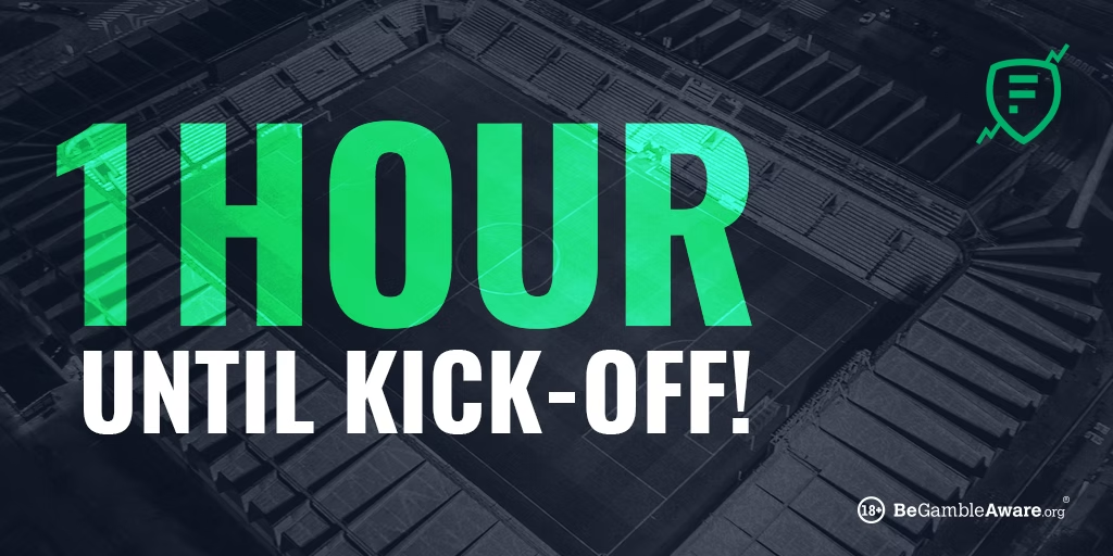
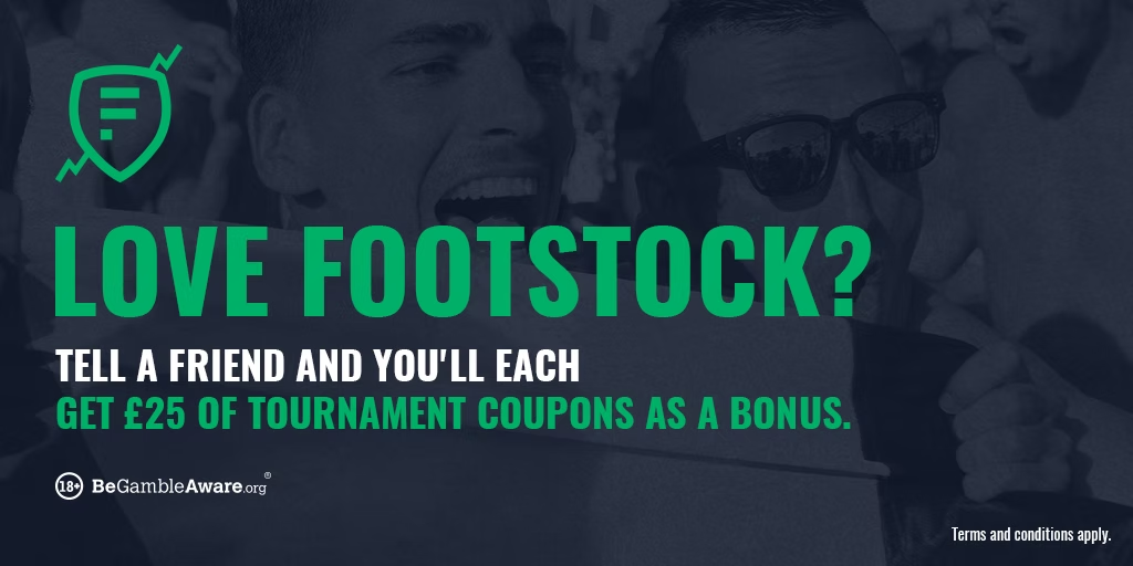
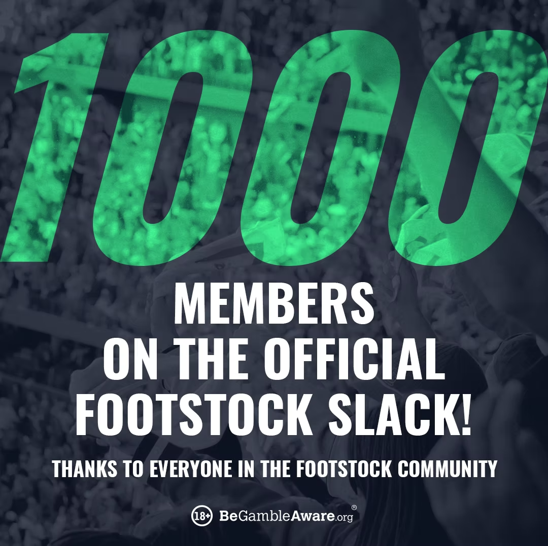
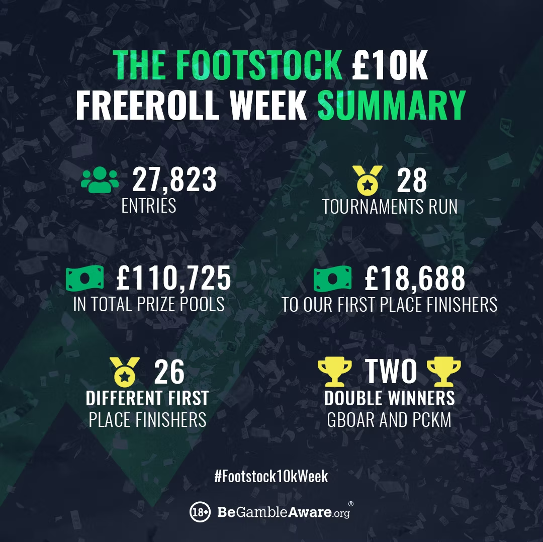
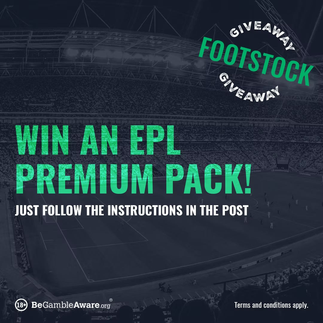
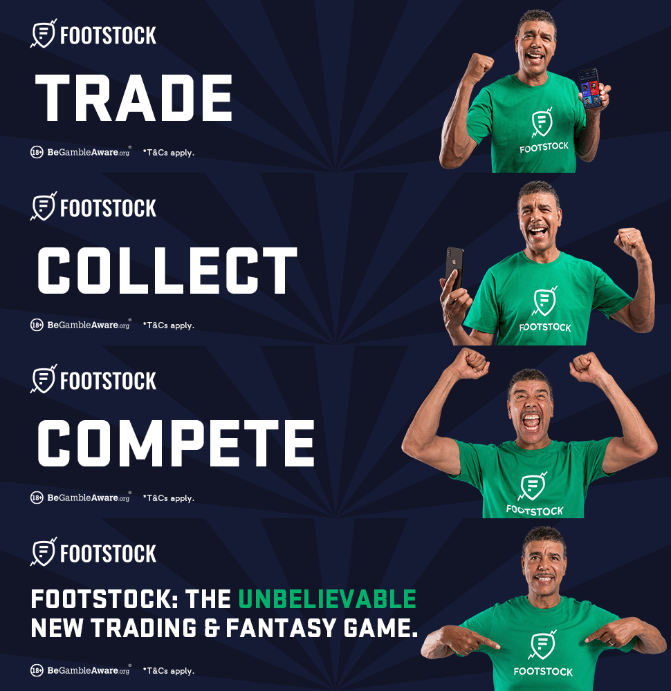
With only a logo, a few colors, and the MVP to go on, I set Footstock's first visual language: a dark navy base, a sharp green accent, and bold condensed type that could carry a matchday message at a glance. From there I produced the everyday content the community saw.

A sharper identity for the 2.0 relaunch
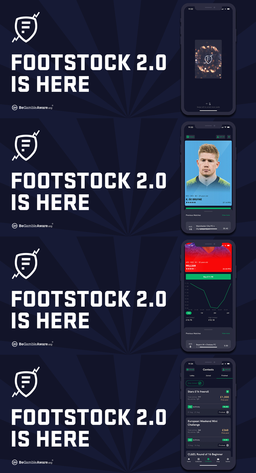
When Footstock rebuilt the product as 2.0, the brand grew up with it. The palette deepened, the wordmark and shield were refreshed, and a brand ambassador gave the identity a face. I carried the new look across every asset the company shipped.
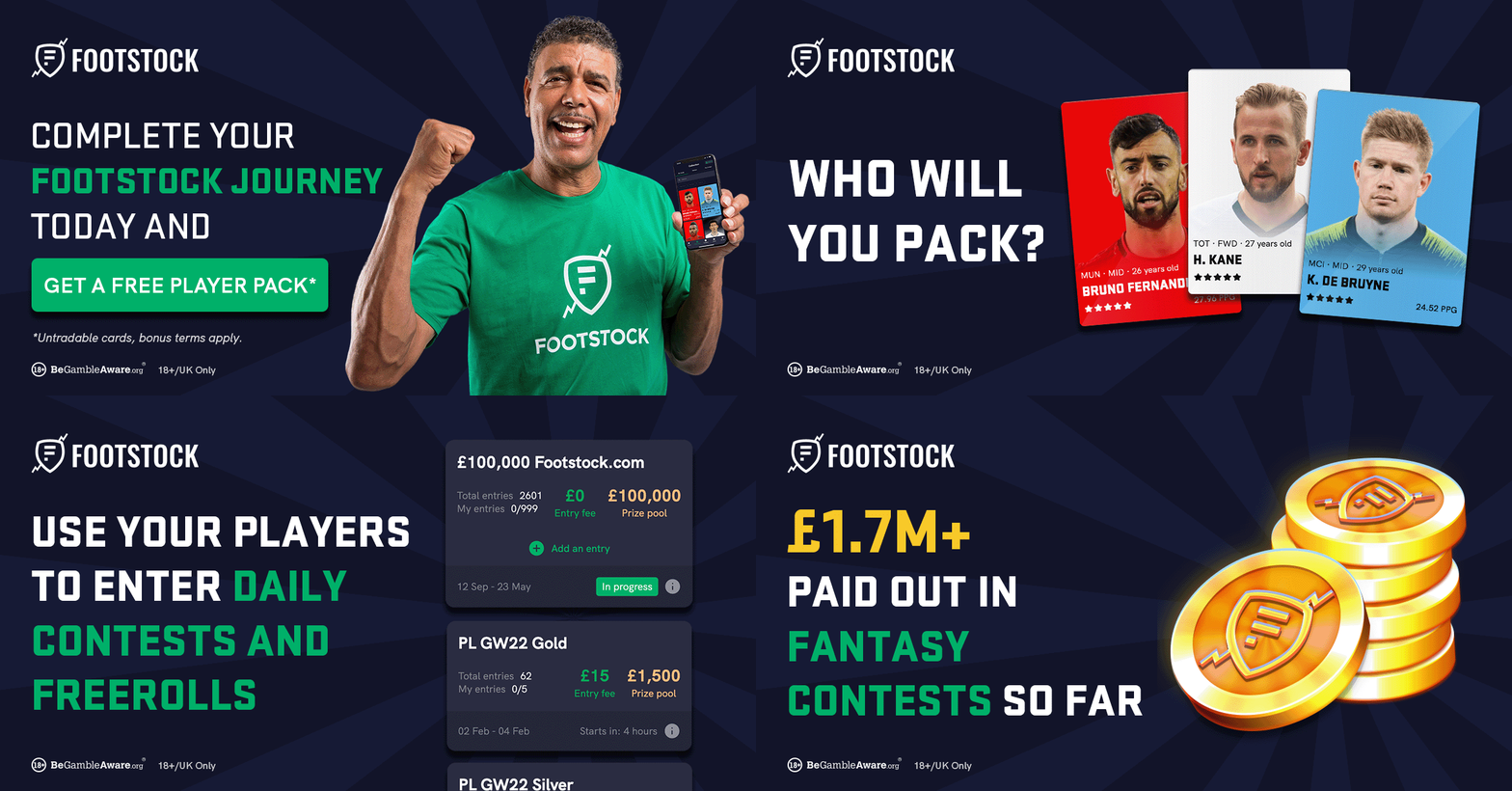
The same asset, before and after
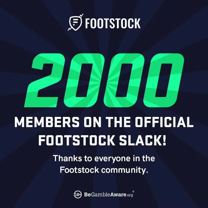
One identity, applied at volume
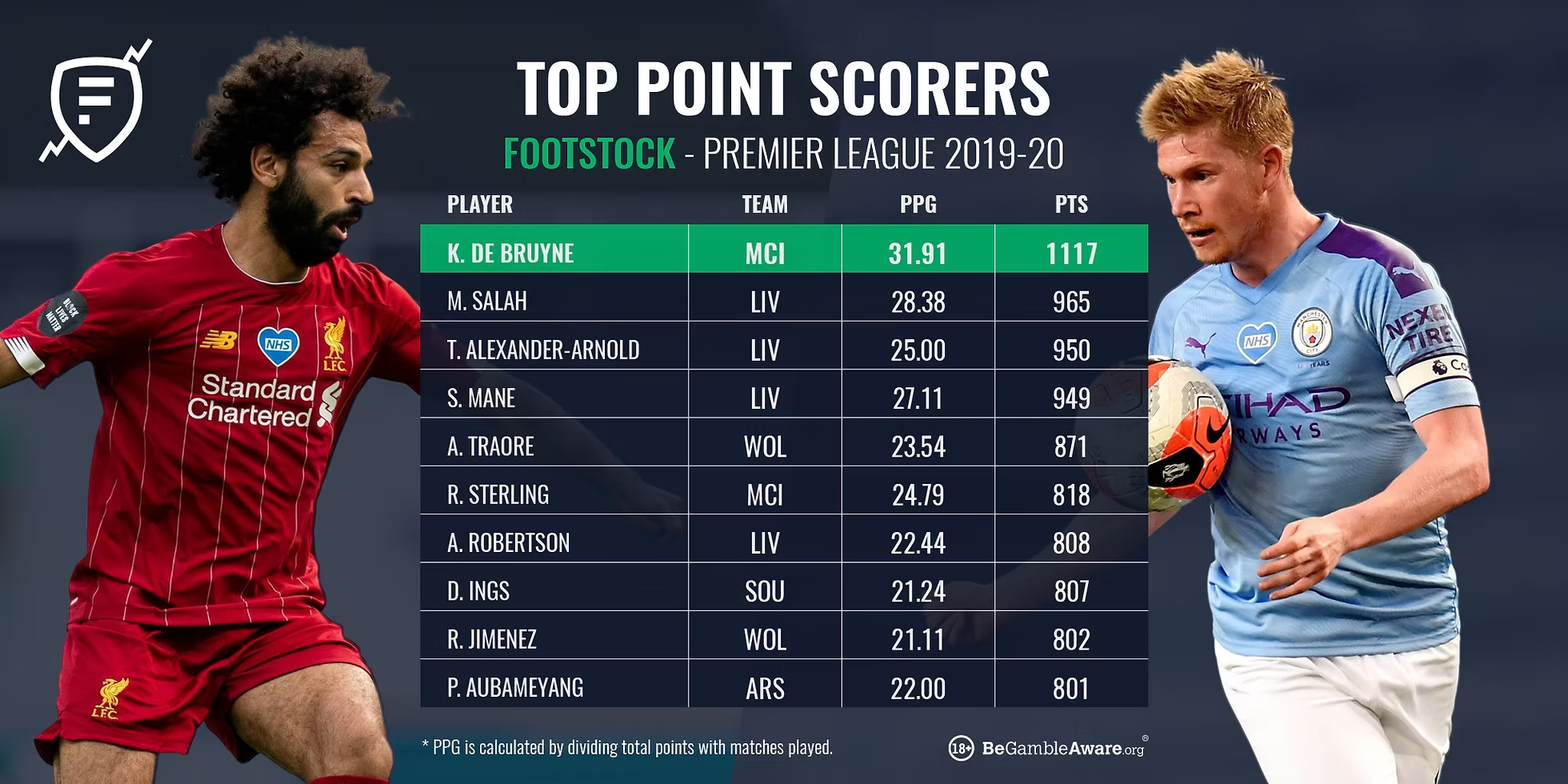
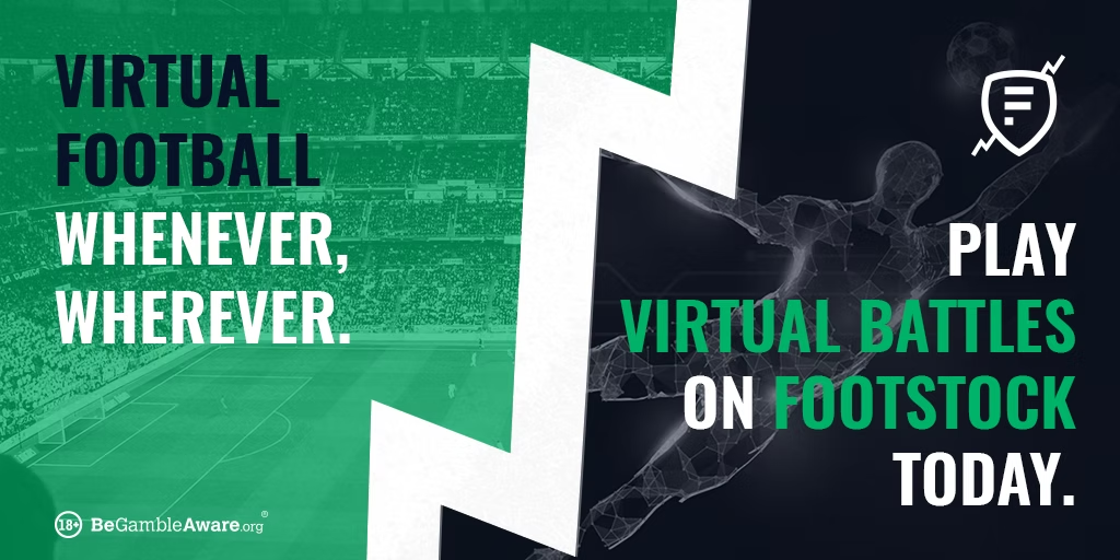
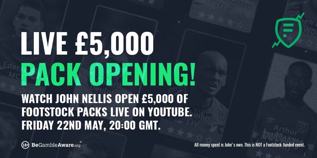
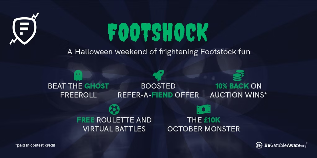
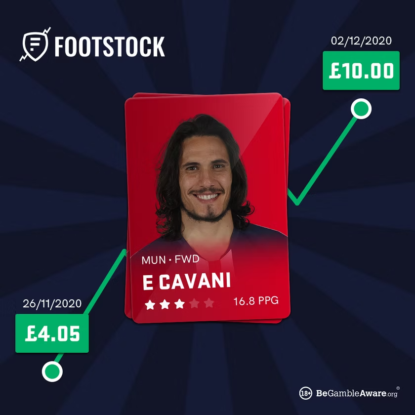
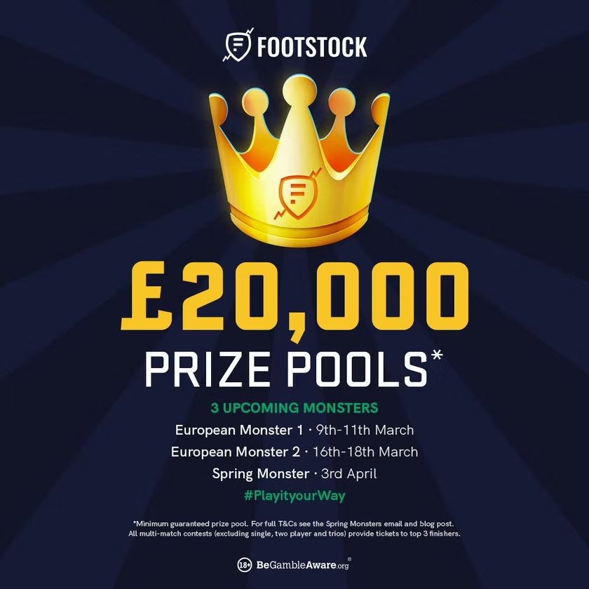
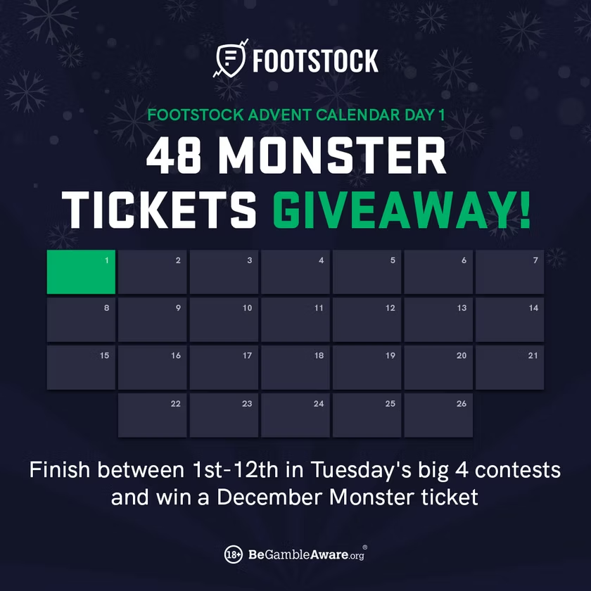
Day to day, the brand showed up as contests, matchday teams, campaigns, and community posts, produced across every format the channels needed, from wide banners to square posts to full-height stories.
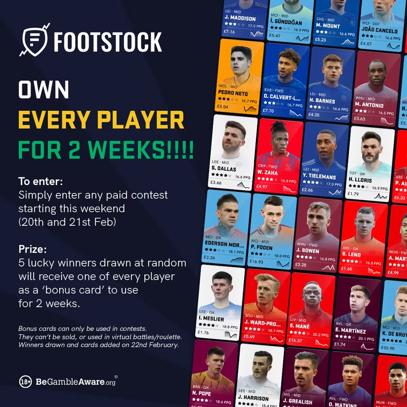
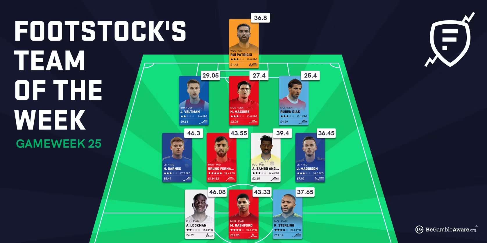
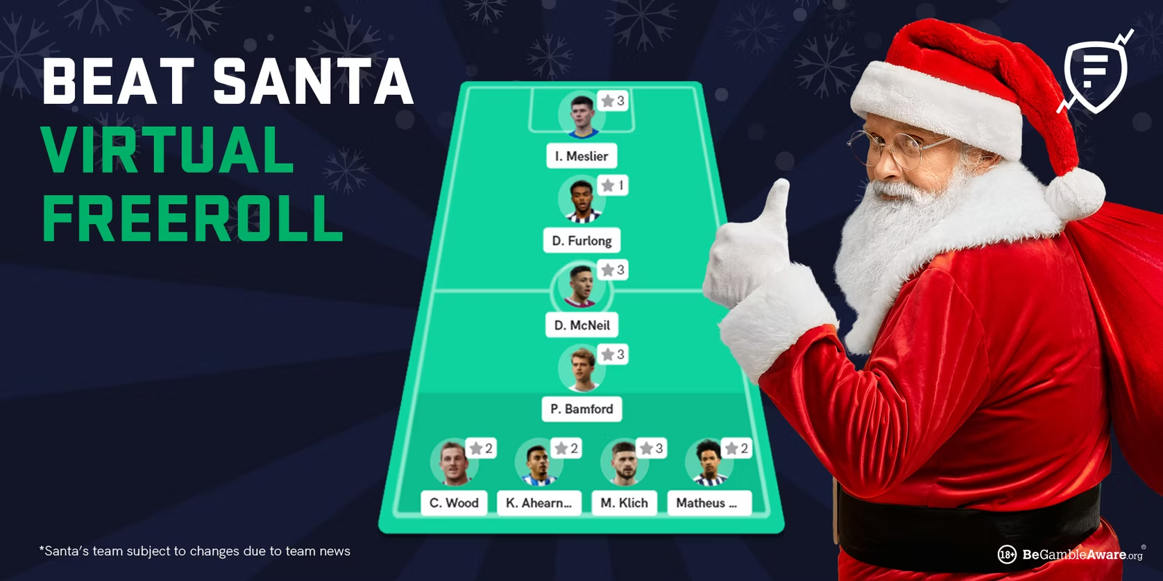
Landscape · feed & banners
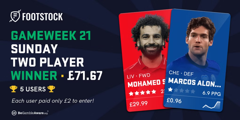
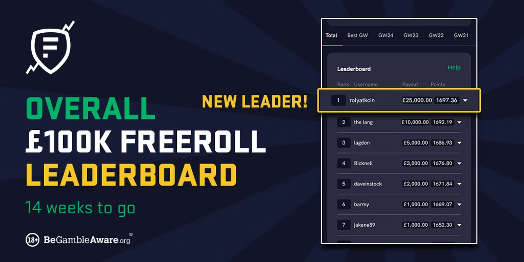

Square · social posts
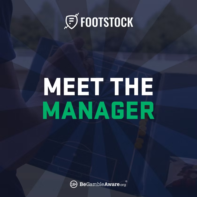
Stories · full-height

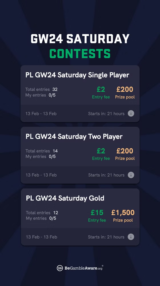
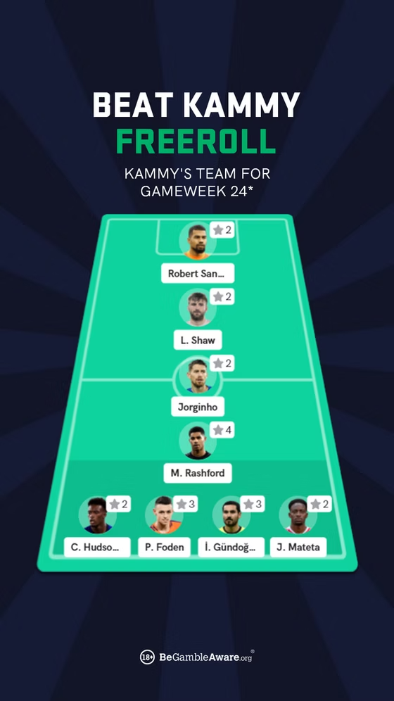
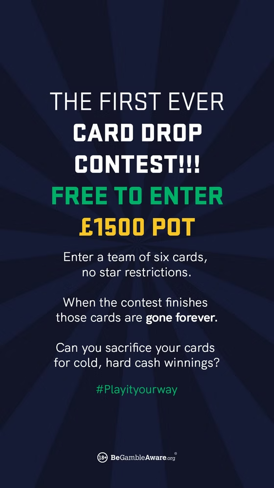
Motion · animated banners
What I took from it
By the time I reached Footstock, I had already been a brand's only designer once, at MyCujoo. What Footstock added was pace: producing at the speed of a live product taught me to build systems, not one-off graphics, so the brand held together no matter how fast the output moved. That instinct, structure first, is the same one I carry into design systems today.
The same steward's eye runs from the MyCujoo rebrand through Footstock and into building FanTeam's identity from a bare logo.